One important feature of SOLARMAN Business is data comparison. Through automatic calculation&analysis and data tracing, all PV plant data can be displayed intuitively via charts.
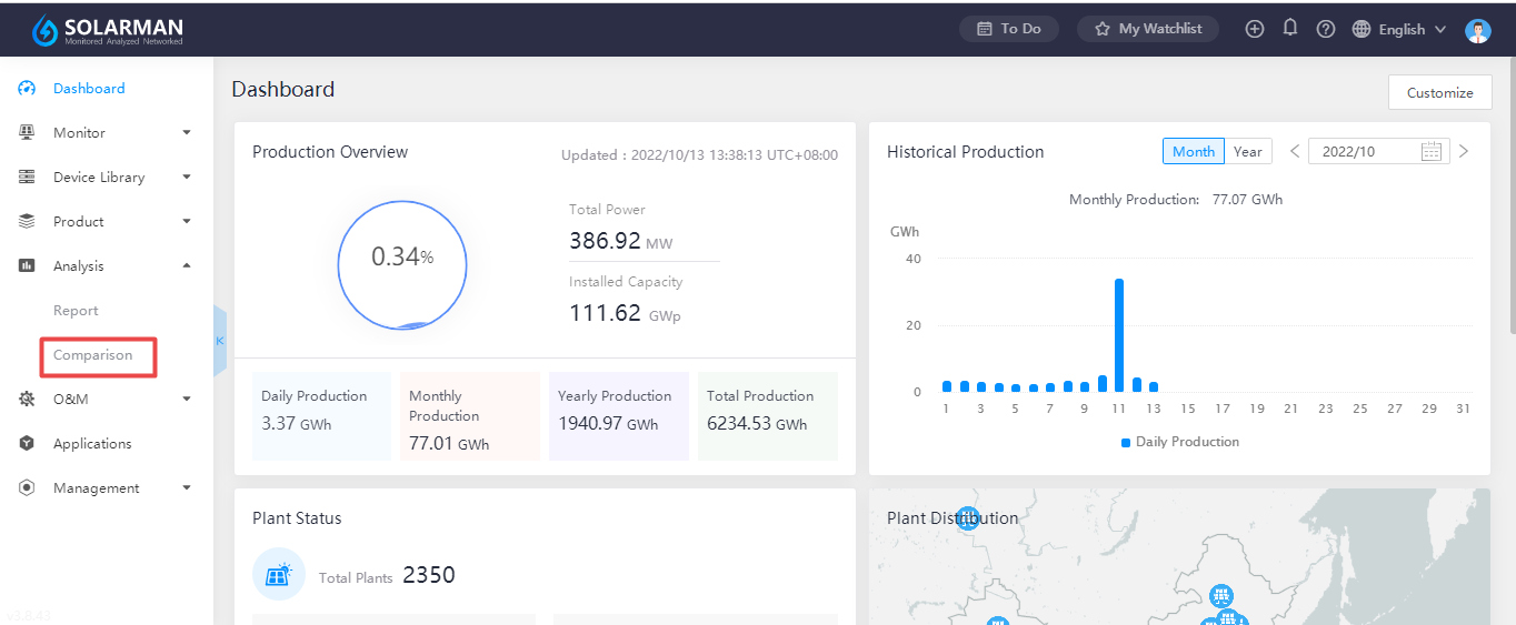
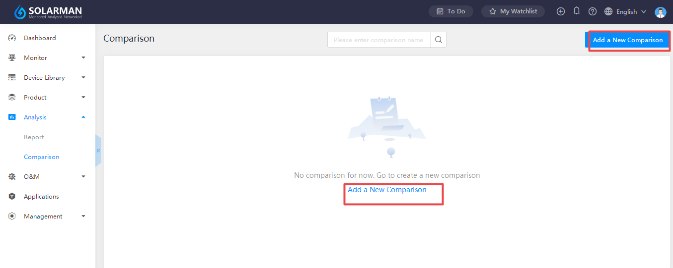
Log in to SOLARMAN Business, click “Analysis”-“Comparison”. Users can click “Add a New Comparison” to proceed.


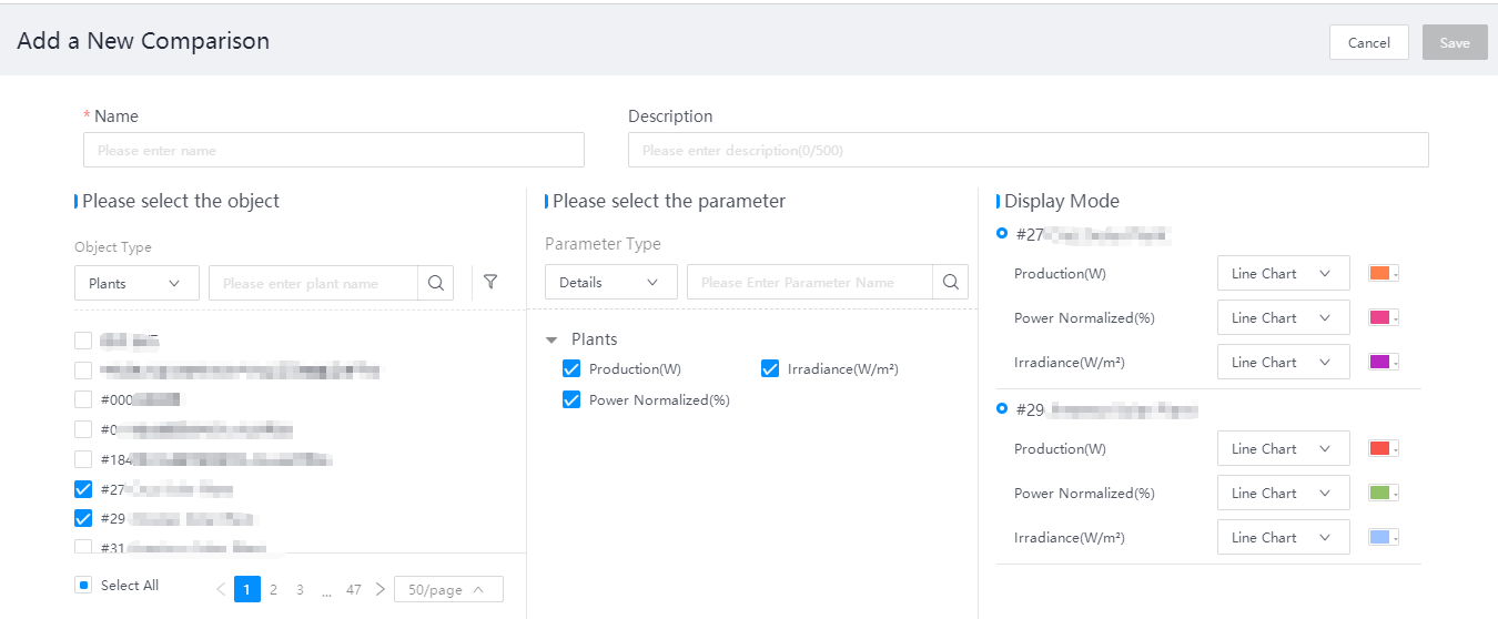
Tick target plants and select the parameter. System will mark different colors for different parameters automatically. Then enter the name for this comparison and click “Save”.

Users can select time range according to their own need. There are two types for selection. One is customized time selection. Another is time range label. And the PV plant data will be displayed in line chart form.

Data comparison makes data more valuable, which also reduces personnel and time cost significantly. Personalized data comparison with multi-dimensional analysis can show periodic fluctuation at a glace.


